
Responsive Design / Mobile Friendly
Over the past 14 years, Off the Page Creations has been developing websites using the latest technologies available, while keeping up with the latest developments in the ever changing internet world. A notable bombshell was dropped by Google in April 2015 when they instituted a major change in the way its search engine recommends websites on Smartphones.

A Huffington Post report revealed that Google, world-wide the internet’s most influential search engine, in a shift that’s expected to sway where millions of people shop, eat and find information, now favors websites that Google defines as “mobile-friendly.” Websites that don’t fit the description will be demoted in Google’s search results on smartphones, while those meeting the criteria will be more likely to appear at the top of the rankings — a prized position that can translate into more visitors and ultimately sales. That’s why Google’s new rating system is being billed by some search experts as “Mobilegeddon.”
2015 was the year that mobile searches surpassed computer searches. As of Mid 2017, nearly 60% of all online searches came from mobile, with food and beverage sectors higher at 72%.
Mobile friendly websites have become more popular over the years, but are now a “must have”. A mobile site is a shortened and simplified version of your current website. If someone is searching for your services or products on a phone, chances are they are out on the road and want to find the information as quickly and easily as possible. A study concluded that 88% of people who do a search on their smart phone, take action within 24 hours. To make the best possible experience for the user, the phone number, contact info, and hours need to be easily seen. Your product or service information should be easy to read and give them the quick answer they’re looking for. You want your site to load quickly and any unnecessary photos or slideshows can be hidden.
Here at Off the Page Creations, we have determined that Responsive Web Design resolves mobile search issues in the most direct and effective manner.
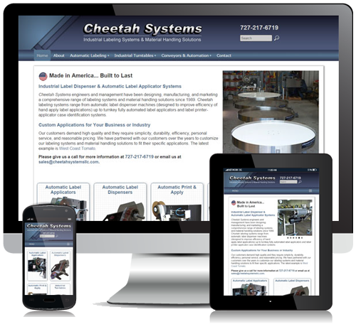
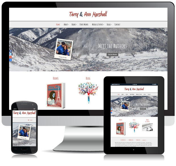
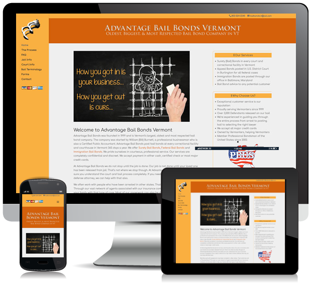
What Is Responsive Web Design?
Responsive Web Design is a web design methodology intended to provide an optimal viewing experience across all internet capable devices. The process incorporates flexible grids and layouts built with percentages, thus able to reflow to accommodate any size screen, whether it be a small smart phone screen, a 7 inch tablet screen, or a large wide screen computer monitor. Additional advantages include the ability to hide or show select elements (images, columns…) based on device size, as well as providing text that is easily readable on smaller devices.
We can help you determine if Responsive Web Design is the best solution for your site.
Here are the elements that make a Web Site “Mobile Friendly”
- Site loads quickly on a mobile device
- Larger type readable on a small screen
- No scrolling left to right or pinching the screen
- No Flash animation that isn’t supported on mobile or tablets
- Resizing images to fit while keeping file size down
- Stacking columns or boxes that get too narrow when reduced
- Hiding unnecessary items or slideshows
- Links far enough apart and large enough to click on
- Links on click, not just on hover
The stats & why it is of critical importance to make your Web Site “Mobile Friendly”
- There are currently more cell phones or cell phone capable devices than there are people in this country
- 90% of American adults own a cell phone
- 80% of all online adults now own a Smartphone
- 42% of American adults own a tablet computer
- 34% of cell internet users go online mostly using their phones, and not using some other device such as a desktop or laptop computer.
Today nearly two-thirds of Americans own a smartphone, and 19% of Americans rely to some degree on a smartphone for accessing online services and information, and for staying connected to the world around them. See pewinternet.org.
The only downside to this approach over a separate mobile site, is that it can be slower to load the additional images because your mobile device uses wireless technology (3G, 4G), which is not as fast as WIFI. But mobile networks are getting faster as the industry concentrates on developing new technologies to serve the mobile device sector. We will always recommend the most seamless and direct methodology for your successful web site needs.
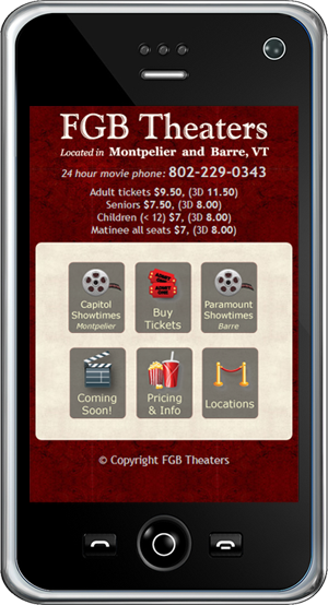
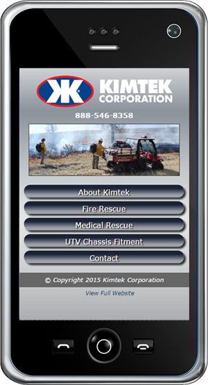
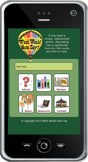
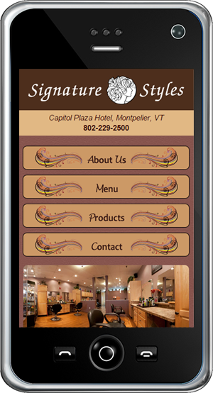
Another Option – A Separate Mobile Site
There may be a situation where redirecting the user to a separate mobile site may be a better solution. In those rare instances, the text and pages are abbreviated for mobile viewing. Essentially there would be two sites – a mobile version, and the regular version. We can discuss that option and recommend the best approach for the most effective web presence.


FREE CONSULTS
For your free consultation, Call us Toll Free at 1‑855‑WEB‑GODS (1‑855‑932‑4637) or 813‑818‑0682 (Tampa, FL) or Email Us